The latest release of SigningHub provides a very handy way to guide users on the form fields they are required to complete before signing the document - navigation tabs. Navigation tabs (or tooltips) guide users through a document in a step-by-step fashion.
SigningHub navigation tabs
This navigation tab is shown on the left side of an opened document as shown below:
On clicking 'Start', the user is taken to the first field that must be filled-in by the currently logged in user:
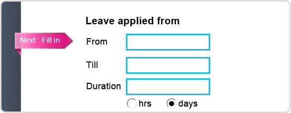
The relevant field is highlighted in a clearly visible blue border. Optional form fields are represented with thin black border as shown below:
Once the first form field is completed, the user clicks the pink 'Next: Fill-in' tag to be taken to the next form field assigned to them:
This process continues until all mandatory form fields (including initials) are processed. The navigation tab will not guide you to any optional form fields in the document.
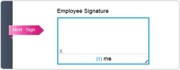
Once all mandatory form fields are filled, click the 'Next: Sign' navigation tab and the user is taken to the page where they must apply their digital signature:
If the user tries to sign before completing the entire mandatory form field then an appropriate error is shown:
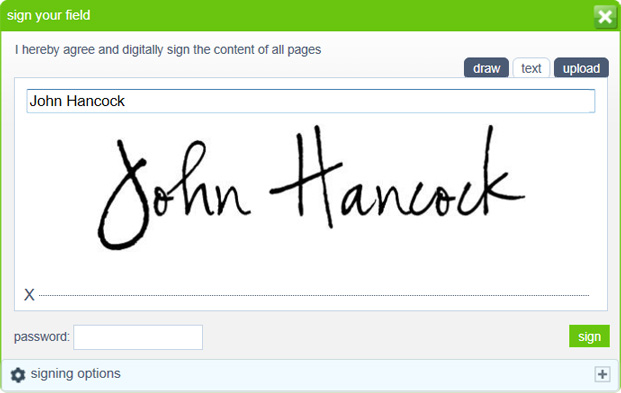
Once all mandatory fields are filled, clicking the signature field shows the normal signing dialog:
Once the document is signed then the navigation tab text changes to Finished:
Clicking Finished will take the user back to MyDesk showing the updated document status i.e. Signed:
As you can see, with our navigation tab it’s easy to ensure users complete all the relevant form fields assigned to them.
Nothing can be accidentally missed as the user cannot sign and complete the process until all mandatory fields are completed. Imagine the time and effort this will save because of incorrectly or partially completed forms in your organisation.
To learn how to add form fields and assign these to particular users in the workflow, see our earlier blog post: Ensuring Correct Form Filling


